 How many mediums did you use?
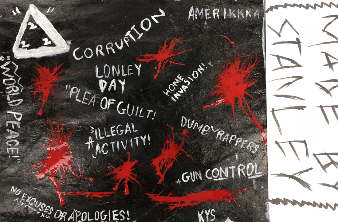
The five mediums I chose to use for my piece were tissue paper, paint, regular paper, marker, and ink. For the my first medium, I decided to choose black tissue paper as I though it would be good way to start off the background for my piece. Next I wanted to go with a very simple design, so I chose white paint for my words. Since I made a big mistake on the right hand side of my piece, I quickly grab a piece of blank white paper to use so I could cover up my mistake. I didn't really know what to do with the blank piece of paper I had on my piece, so I just added my name to it so people would know it's mine. Finally I only needed one more medium, so I picked up red ink to use just to add a little something to the piece. What was your word and how did you portray it? I honestly forgot what the word I chose was, but the message behind my whole piece was what's wrong with our society at this point in time. I wanted to use just a blank canvas with words that just portray the problems we are facing. I used words like dumb rappers to show how rappers are negatively influencing our youth, gun control for all of the current mass shooting that are taking place with no action on the regulation of guns, and Amerikkka to show that we are still living in a racist and hateful state.
What perspective did you use?
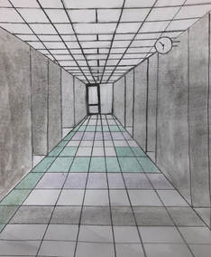
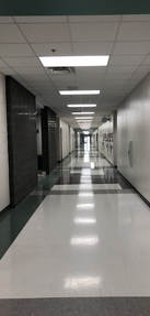
I used a 1 perspective for my piece About the photo The photo I used for my piece was a picture of the school hallway. I thought it would be a cool picture to recreate because I like the way how the perspective shows that hallway appears to become smaller the further you're away from it What did you find difficult about the project? The most difficult part of the project for me was finding the right saturation for the colors. It was a long process making the color match the same as the tiles in the picture How did the two warm-ups you picked help? Didn't do any of the warm ups Told me not to worry about doing it because I missed to many days when you were teaching the portrait unit.
What warm up is proving to be most helpful?
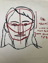
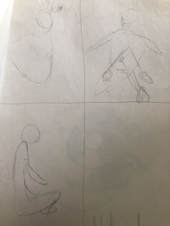
For me the most helpful warm up we've done so far is the Skelton cartoon. It helped me get a better understanding on how to start of sketch, where to place each facial, and how to form the structure of someone's face to make it look realistic What did you find the most surprising about the facial proportions? The most surprising feature to me while working with the facial proportions was the placement of the eyes, nose, and mouth. When I always use to draw portraits of people, I thought that the eyes and nose were right in the middle of the persons face when drawing it. Comes to find out hat when you're working on a portrait, it should all be placed slightly below the middle of the circle because you want to be able to make room for the hair. (WAS NOT HERE FOR HAIR, BLIND CONTOUR, OR FACE PROPORTIONS)
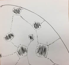
How does your piece show of the theme of line?
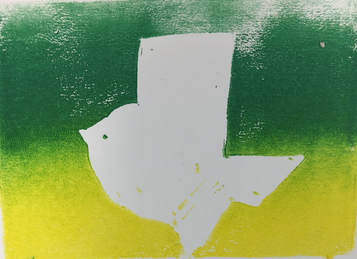
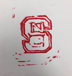
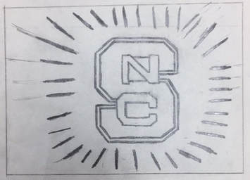
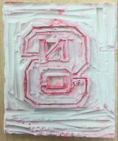
For my piece, i wanted to make something that means a lot to me. I decided to chose the NC State logo for my linoleum block fory . NC State has been my dream school ever since freshman year, and i thought it would be cool to make a piece of art that has a vast impact on my life. As you can tell from the NC State logo, there it is all lines, no circular objects in it. t shows of the theme of line because everything about the logo is linear, even the C. How is your piece successful? What might you change if you could do it again? To be honest, my linoleum stamp was not really successful. My print didn't turn out as sharp and precise as i wanted it to be. If i could do it again, I would've of focus more my time to get precision cuts through my linoleum block, so miy piece could end up turning out clear and not in a mess.
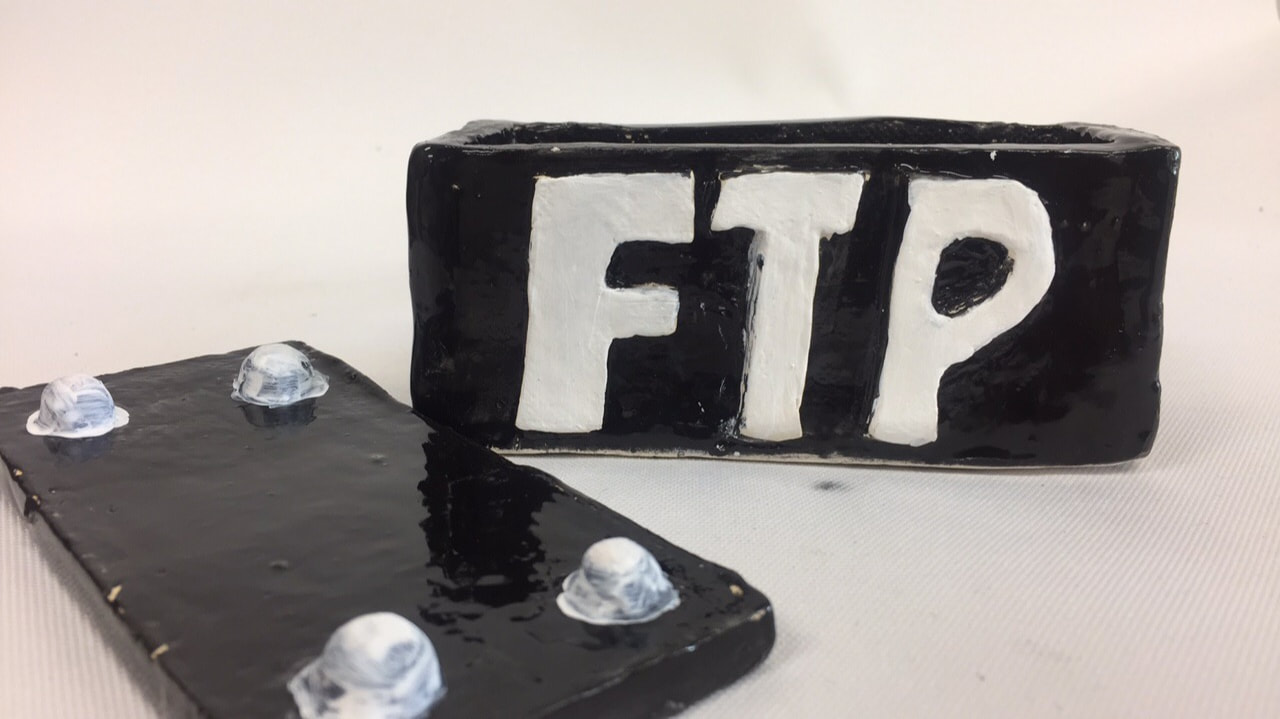
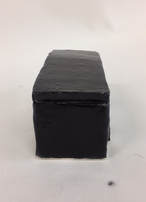
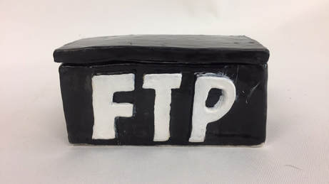 In Process What do you plan to do with your piece? With my piece, i plan on making a box inspired by my favorite designer/clothing brand. FTP is a clothing brand designed by a guy from California named Zac Clark. His designs and concepts for his clothing are considered edgy and no holds barred, and a lot of people despise it. The reason why his clothing inspires me is because he has the perception that even though you have people that hate on what you're doing, just deal with it and keep on doing what you love. I plan on making a rectangle prism with the three words FTP on the side of it. For the top, I'm going to make a 4 dot top that fits inside the box perfectly. And lastly I plan to complete is with a matte black finish and white letters. What things have you found the most difficult? For me the most difficult process of my box was making the three letters. It was hard to get a precise cut and smooth look for the letters, and also the duplication process took a while. What do you find successful so far? I honestly think that most successful part of my sculpture it the shape of box. The shape of the box is almost close to perfect and the scoring and slipping process on the box was immaculate What's your process? I grabbed a big ball of clay to get started off. I then put that ball of clay trough the slab roller to create my slab. I cut the slab into 4 equal rectangles and 2 mid-size squares. I used the scratch and slip technique to combine all of my pieces together Finish Piece Process since Once i've completed the process of making the shape of my box, it was time to add some razzle dazzle to it. First i have to put my box in the kiln and fire it up to make it become bone dry. once it's harden, it was time for me to add color to it. I used a black glaze for my box to give it a glossy polished look. I decided to leave the letters alone, as for it is already white. What do you find successful about the finished piece? The most successful part of my piece is the color of my sculpture. I really liked the black I chose for the box because it really made the box pop even though the color is black What would you have changed if you were to do it again? If i could work on my box again, i would've added something to the letters. The letters on the box looks very bland, and i feel like if i added a glaze to it, it would have made the piece complete.
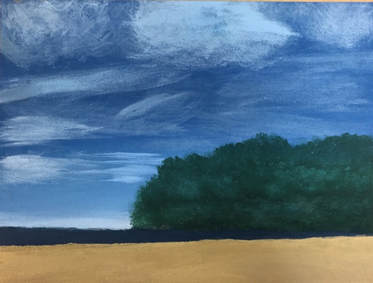
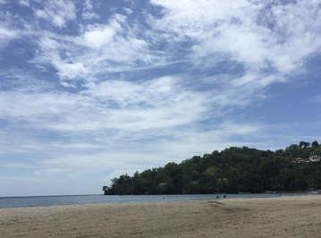
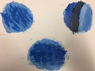
What place is represented in your art?
The photo I used for my idea of place was a picture of the beach. I took this picture over the summer of 2017 in Trinidad and Tobago. Trinidad and Tobago is a small island located near South America (closest to Venezuela). When i say the island is small, it really is small. The population of the island is around 1.3 million. To give you a comparison, North Carolina has a population of 10.27 Million, and that's only a state. This place is important to me because Trinidad is where my mom was born. Most of here family is still located on the island, so every time I visit, I always enjoy getting in touch with my relatives. I visit the island 5 times in my life, and i can honestly call it my home from home. What did you find the most challenging about the picture about the picture you picked? For me, the most challenging part of my piece was the water. It took multiple attempts to get the perfect shade of blue, and it still isn't perfect What do you feel is most successful about your piece? I think that the clouds in my painting was the most successful part of my piece. I believed that the color I chose and the effects I provided on the clouds were spot on. What was the process for your piece The process on creating my painting wasn't relatively long. First i decided to start of with making the background. I chose a semi-light blue to represent the sky. Next, i started to make a green to represent the backdrop of my piece. I dotted the paper with light pressure in order to get the leafy effects of the trees. Then, i got started on making the water. Ms. Sudkamp suggested me to make a darkish blue by mixing green and blue instead of just having a standard blue. When i painted it on the canvas, it gave my piece a more realistic image of the ocean. And lastly, i created the sand. The sand took me less than 2 minutes to create. Once i painted the sand on my piece, my painting was finally complete.
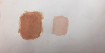
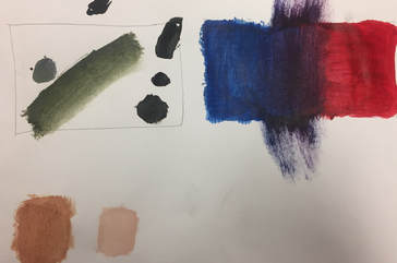
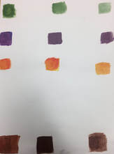
What did you learn from this activity?
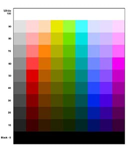
With the color mixing activity, I learned how to utilize the three primary color (Red, Blue, Yellow) in able to make the shade of your choice. Also with the colors we used, we learned how to blend and shade in one color into another for a smooth color transition How do you make brown? In order to make brown, you need to use two primary colors to make a secondary color. Once you have your two secondary colors, you can mix them to make a brown. The shade of your brown depends on what two colors you use. The colors that make brown are Orange to Blue, Purple to Yellow, or Green to Red.
What warm up was the most helpful to?
For me, the most helpful warm up was the Sign language drawing. This was my first introduction to drawing in Art 1, and learning how to draw the contours of figures and go into specific details of an object really helped me with my drawing skills Define Composition and Value Composition: The placement or arrangement of the elements of art in a work Value: The art element that describes the darkness or lightness of a color or object Pros and Cons of each medium Pencil Pros: With a pencil I feel like it's the most easy to maneuver because we use pencils almost everyday, and if you mess up, you can easily erase it Cons: When you're drawing and accidently touch your drawing, you put yourself at risk of smudging your work Charcoal Pros: If you make a mistake on your drawing, you can easily smudge your drawing to make seem like nothing ever happened to your paper Cons: With charcoal, it's hard to get a precise drawing of your object. Especially with the charcoal pencil, whatever you draw relatively end up turning out thick. Pen Pros: When drawing with a pen, you are able to get a precise drawing because of its smooth ball tip Cons: Since you can not erase pen, any little mistake you make on you paper is crucial to your drawing |
AuthorWrite something about yourself. No need to be fancy, just an overview. Archives
June 2018
Categories |
 RSS Feed
